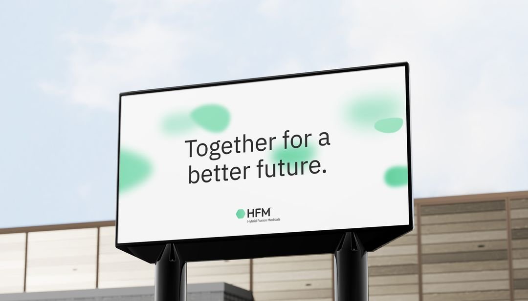
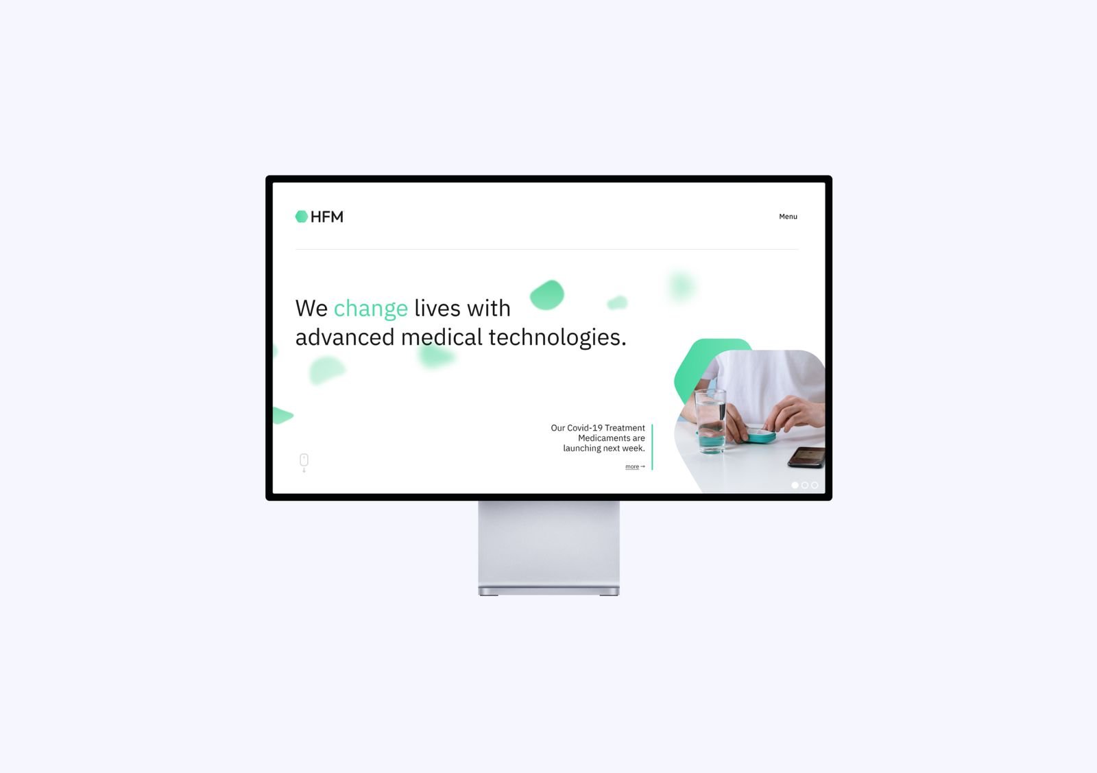
Our Hybrid Fusion Medicals branding and web design concept aimed to bring science and technology to life. A pharmaceutical company with a focus on people.
The basis for the brand atmosphere is formed by the green-colored blood cells floating through the world. They symbolize progress, closeness to people, health and cooperation.
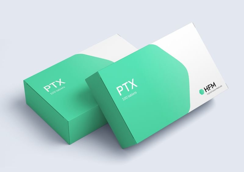
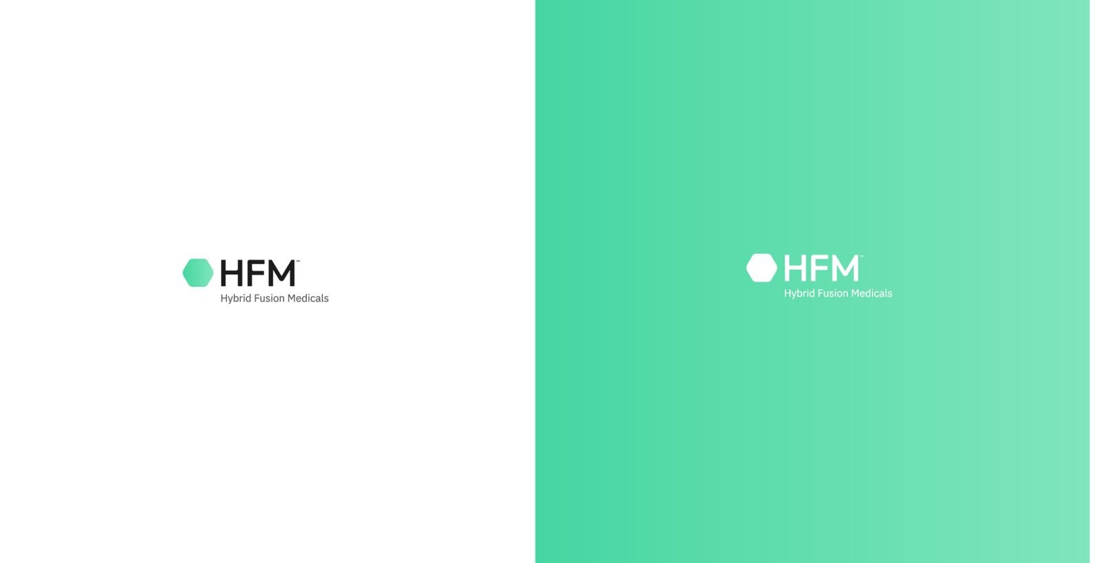
A look at the market environment prompted us to establish the color HFM Mint. It stands out from the industry and offers a lot of potential for recognition value.
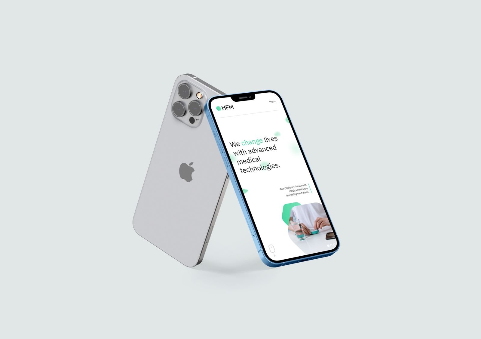
The web concept for HFM follows the clear visual language and avoids overcrowding. Individual information is brought into focus in order not to overwhelm the user and to appear human.