For a new doctor's office for children and young people in the city of Lucerne, we developed a brand concept that was playful but also youthful in order not to scare off older customers.
The color palette mainly uses the trust color blue to give parents and children a sense of security. At the same time, the KJA brand draws attention to itself with the accent color orange so as not to appear boring.
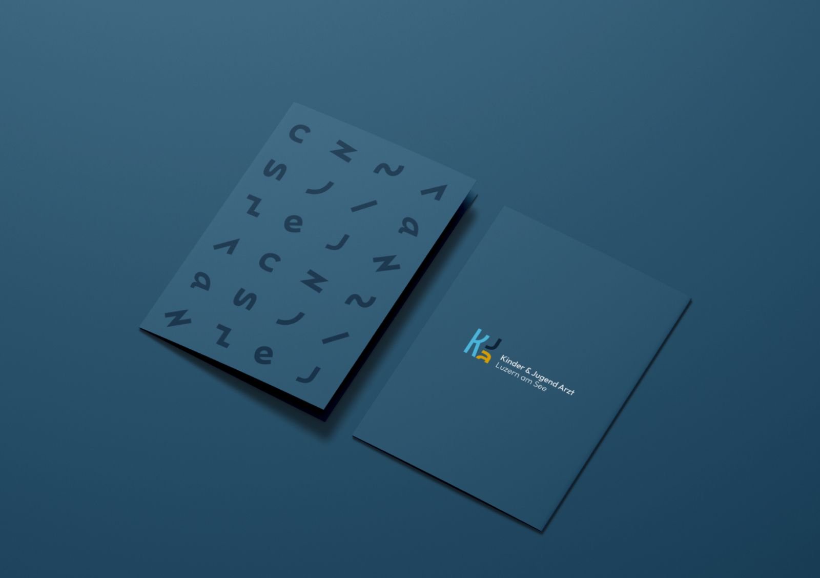
The typography of the brand design is playful in the symbol, but remains serious with modern geometry and clear language. In order to set up the doctor's office digitally, an SEO-friendly name was given high priority.